Psychology Concept
The inability to make a decision is caused by overthinking a problem. This often happens when dealing with too many variables and continually researching solutions instead of taking action and deciding.
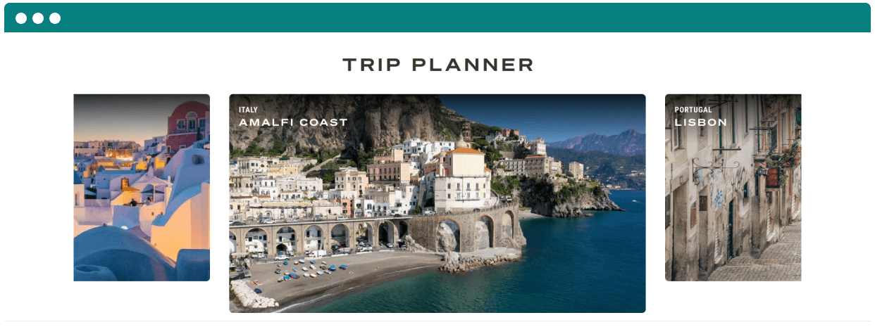
Users arrive at the Travel + Leisure Go website fashionably late in their travel journey, leading to missed engagement and threatening our competitiveness against rivals who offer more seamless experiences.
Here’s what I did:
Requirements gathering
User research
Concept designs
Prototyping
High fidelity designs
Usability Testing
Stakeholder presentations
Case study contents:
Discovery → Design solution → How we got there → What I learned
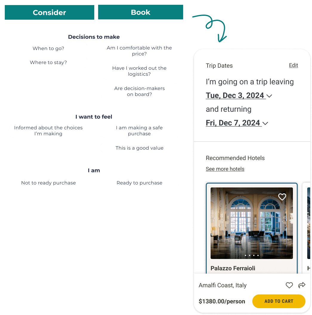
Through a combination of user surveys and interviews, we learned that potential customers faced a daunting challenge: an overwhelming maze of options without a clear path to making them a reality. Common challenges emerged, like staying on budget, group planning, and the complexities of travel logistics. All this led to something terrible: analysis paralysis.


Armed with research, a laptop, and a hefty amount of caffeine, I set out to create our travel planner. My goal was to empower travelers to explore destinations and customize itineraries while reducing feeling overwhelmed by too many options.
This design includes:
Guided by the users' travel journeys, I curated questions that steer users through the trip planning process. This approach ensures a personalized and intuitive experience, an essential aspect of our travel planner.
When designing the travel planner questionnaire, I focused on making it effortless and enjoyable for users. During the testing phase, we got critical feedback that shaped my next iteration.
When designing the travel planner questionnaire, I focused on making it effortless and enjoyable for users. During the testing phase, we got critical feedback that shaped my next iteration.
Users enjoy bringing their furry friends on their adventures. This discovery inspired us to add pets to our “Who is going with you?” section.
Users crave flexibility in their travel planning. They nixed the traditional date picker we had initially been relying on. I pivoted to this “Mad libs” style interface, where users can fill in details like “anytime in June” or “next weekend.”
Users want to incorporate big life events into their travel seamlessly, so we introduced birthday and anniversary celebration features to our trip planner. This addition directly responded to their desire for more personalized trip planning. We have also created an ‘Other’ category for unique ideas.
Adding a fun loader isn't just about passing time—it's about making waiting moments enjoyable. By injecting creativity and personality into these brief pauses, we turn them into delightful experiences that leave an impression.
Well, not quite.
But, we learned that buying multiple items simultaneously could crash our system. This issue was supposed to be fixed in a prior sprint but was deemed out of scope due to its complexity. Just like that, our dreams of a travel shopping cart were dashed.
Technical glitches like this happen all the time in digital product development, and design needs to be able to pivot instantly.
Despite this setback, we did not give up. Our team worked together and used our expertise to find a seamless solution by calling the APIs individually and orchestrating a simulated package checkout. It would look seamless on the front end but happens one at a time on the back end.
With the shopping cart debacle behind us, we set our sights on refining the results page.
We made sure to give users options for destinations with similar pricing. Users can explore destinations through engaging videos, giving them a better feel for the location.
During testing, we learned that users appreciate options but want guidance when making decisions. This led us to introduce features like "best value" and "upgrade," helping users confidently compare and select options.
Food is a central part of the travel experience. Some travelers are passionate foodies eager to discover new restaurants, while others prefer the budget-friendly option of having groceries delivered to their rooms. While grocery delivery isn't part of our MVP, we tested it for future inclusion.
Copyright © Trinidad M. Pena | Download My Resume | Linkedin Profile
The inability to make a decision is caused by overthinking a problem. This often happens when dealing with too many variables and continually researching solutions instead of taking action and deciding.