The inability to make a decision is caused by overthinking a problem. This often happens when dealing with too many variables and continually researching solutions instead of taking action and deciding.
Award-winning UX designer, creating beautiful experiences that inspire connection and drive engagement.

Site Navigation
Taming the Beast
Our site was facing a very good problem: so many excellent features that the navigation began to get unwieldy. We needed to consolidate.
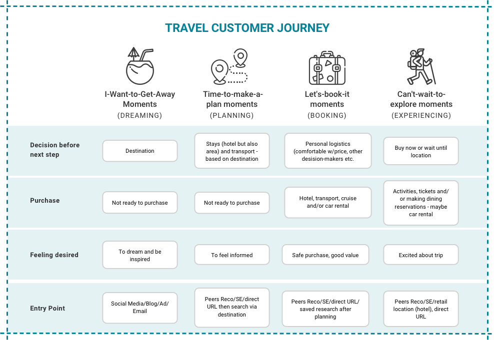
I started with a customer journey. I used Google’s Micro-Moments as a framework. By concentrating on how a user wants to feel, I could figure out what decisions needed to be made before moving on to the next step. I, then, talked to travel customers to solidify the journey.
My Role
Information
Hierarchy
Journey Mapping
User Research
UI Design

Customer journey using Google’s Micro-Moments as a framework
Information Hierarchy
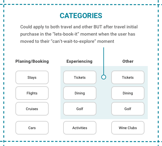
Next, I categorized the pages according to where the visitor was in the user journey. Two huge problems emerged immediately:
- There wasn’t anything for people in the “Dreaming” step of the journey.
- There was too much overlap. Some pages applied to travel, but they could also be purchased outside of a travel experience.

Sorting the content into categories
What I Recommended
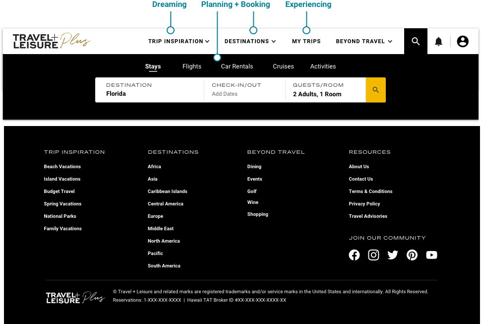
My solution? Create entry points for users at every stage of their journey. Add “Trip Inspiration” for people in the Dreaming stage. Add “Destinations” for people in the Planning stage, since where you’re going is usually the first decision you make before starting to plan.
Because some products are sold after the initial purchase, I created components showcasing those products on confirmation pages, as well as natural entry points after purchase. I also developed a plan to use email and ad targeting to promote these products long past the date of purchase.
Lastly, I established a “Beyond Travel” category for all items purchased outside of the travel journey, to keep users engaged and build long-time buying habits.

The re-organized navigation header and footer
Reflections + Next Steps
What Did I Learn?
Sometimes the original assignment isn't what is best for the user. We wanted less in the top navigation, which we did but I ended up adding more using dropdowns. Let's get into why.
Buying travel is a multi-step process, and it's important to cater to users at every step. We had the booking and experiencing steps on lock, but we were lacking in the first 2 steps. The editorial side of this brand has plenty of trip inspiration - perfect for those in the dreaming step.
For planning, getting an overview of your chosen destination is helpful. You can't get to the booking step until you make some decisions. You need to know when to go and what neighborhood to stay in before you pick hotels and flights. Being able to access that info fast, not only makes users happy but helps with conversions.
Copyright © Trinidad M. Pena | Download My Resume | Linkedin Profile
