The inability to make a decision is caused by overthinking a problem. This often happens when dealing with too many variables and continually researching solutions instead of taking action and deciding.
Overview
Quest for Adventure: How We Turned Travel into a Game
Users only visit the website a few times a year when they need to book travel. Talk about a hit-and-miss relationship—these sporadic visits add to missed revenue opportunities and reduced brand loyalty.
Here’s what I did:
Stakeholder Interviews
Comparative Analysis
User research
Concept designs
High fidelity designs
Prototyping
Usability Testing
Stakeholder presentations
Case study contents:
Discovery → Design solution → How we got there → What I learned
Discovery
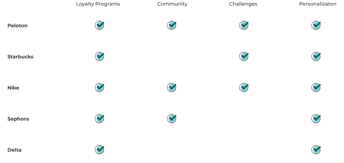
Comparative Analysis
Emboldened by the sound of Slack notifications in the background, I embarked on a side quest to solve the mystery of sporadic user engagement. Deep in the research dungeon, a beacon of hope emerged: gamification.
After conducting a comparative analysis, I discovered that integrating loyalty programs, gamification, and user challenges can significantly boost traffic and engagement. Learning lessons from the successful strategies of brands renowned for brand loyalty, we found inspiration to enhance our user experience and traffic.

Discovery
Business Goals and User Objectives:

Encourage users to visit the website more often by offering compelling reasons beyond immediate bookings.

Create a sense of community and competition through challenges & leaderboards for users.

Collect data from challenges to refine personalization.

Encourage users to share their achievements on social media platforms, giving them a sense of pride and accomplishment.
Design Solution
Ruling the World, One Badge at a Time
Picture this: you're a modern-day explorer, amassing badges from each of the wonders of the world you've visited. Every badge celebrates your adventures, from marveling at the Taj Mahal's splendor to braving the heights of Machu Picchu. And when you display these travel triumphs on social media, your friends dream of their own encounters with the majesty of nature and culture around the world.
Well, that's the feeling I aimed to capture with my design.
This design includes:
- Challenges landing page - Our main page for finding new challenges
- Individual challenges - How you participate
- Profile challenges section - Where you can see all of your challenges
How we got there
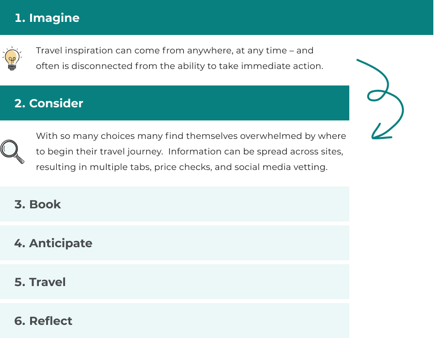
From Imagine to Consider
Challenges aren't just fun - they can transition users from imagining to considering their travel plans. By tying these engaging tasks to destinations or activities, we can prompt users to consider their next adventure. That shift from dreaming to planning is seamless and exciting, fueled by the entertaining, interactive nature of the challenges.

How we got there
How User Input Shaped the Experience
Gathering and engaging with user feedback allowed me to enhance the travel challenges and create a more captivating and effortless journey for all participants.

Our loyalty program, inspired by the popularity of airline loyalty programs cited in our research, rewards users for their travels. As they explore, they unlock discounts, transforming their journeys into rewarding adventures.

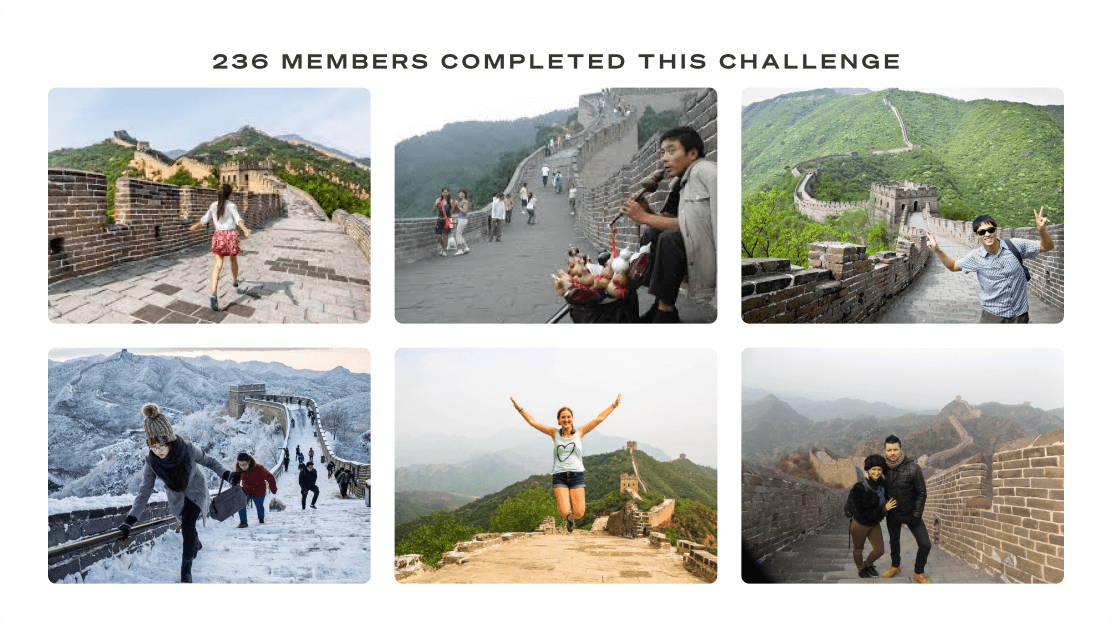
Seeing snapshots of users completing challenges is a powerful motivator. Who doesn't love living vicariously through the epic journeys of fellow travelers? Our user research confirms this—people connect with these snapshots of success!

Leaderboards for challenges add a dash of competition, urging users to push their boundaries and strive for the top spot. This dynamic fuels heightened engagement and participation and consistently receives high ratings in our user surveys.
How we got there
User’s Achievements Drive Traffic
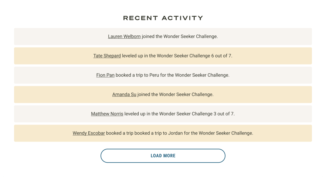
User achievements, fueled by the Zeigarnik effect, ignite excitement and motivation. Thanks to our badges, discounts, and prizes, each step becomes a celebration, fostering community and recognition. As users share their achievements, they become platform champions, drawing in others organically.
What I learned
Life Lessons

Community and Recognition Matter: Users want more than just transactional services. They crave a sense of community and want recognition for their achievements.

Visual Stimuli: A picture is worth a thousand words; in our case, it can drive you to action. Seeing snapshots of others conquering challenges and leaderboards ignites a user's competitive spirit - and sense of adventure.

Harnessing the Zeigarnik Effect: Achievements and challenges create an unfinished loop, compelling users to continue their journey toward completion.
Copyright © Trinidad M. Pena | Download My Resume | Linkedin Profile
